Front:

.JPG)

Back:

The font that we will be using for our body copy is the ‘Prestige Elite STD’ and the size will be appropriate to the product that is being created. The font that we will be using for the subheadings is ‘Prestige Elite Std’ again but use bold or italic. A size that is suitable to the product. The reason that we have chosen to use this font is because it is similar to the font style used on the logo, this means that the sense of a typewriter is followed throughout the project and becomes a convention of our band.
The colour scheme for the house style that we will be using across the project is black and white, this is because the colours contrast with each other and stand out more to the audience. The music is quite mellow and not a very upbeat song, the lyrics are about a couple just trying to make the relationship work. The colours represent the narrative. Black and white are contrasting colours, they show two sides to the story.
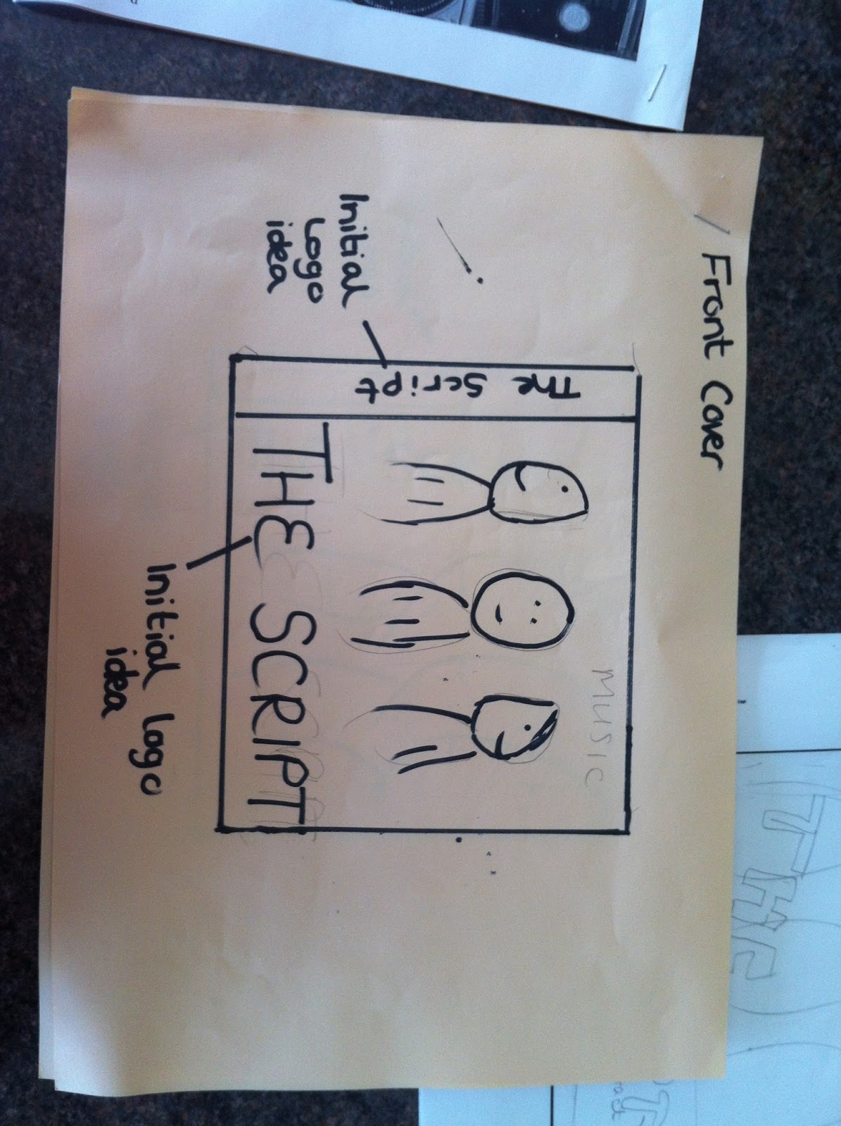
There was one digipack that really inspired me which was The Script. I like the way they have kept the colour scheme flkowing throughout and how they have included band shots but not only abstract images that represent 'togetherness' of linking hands and touching.
No comments:
Post a Comment